Dare to Fly
2018
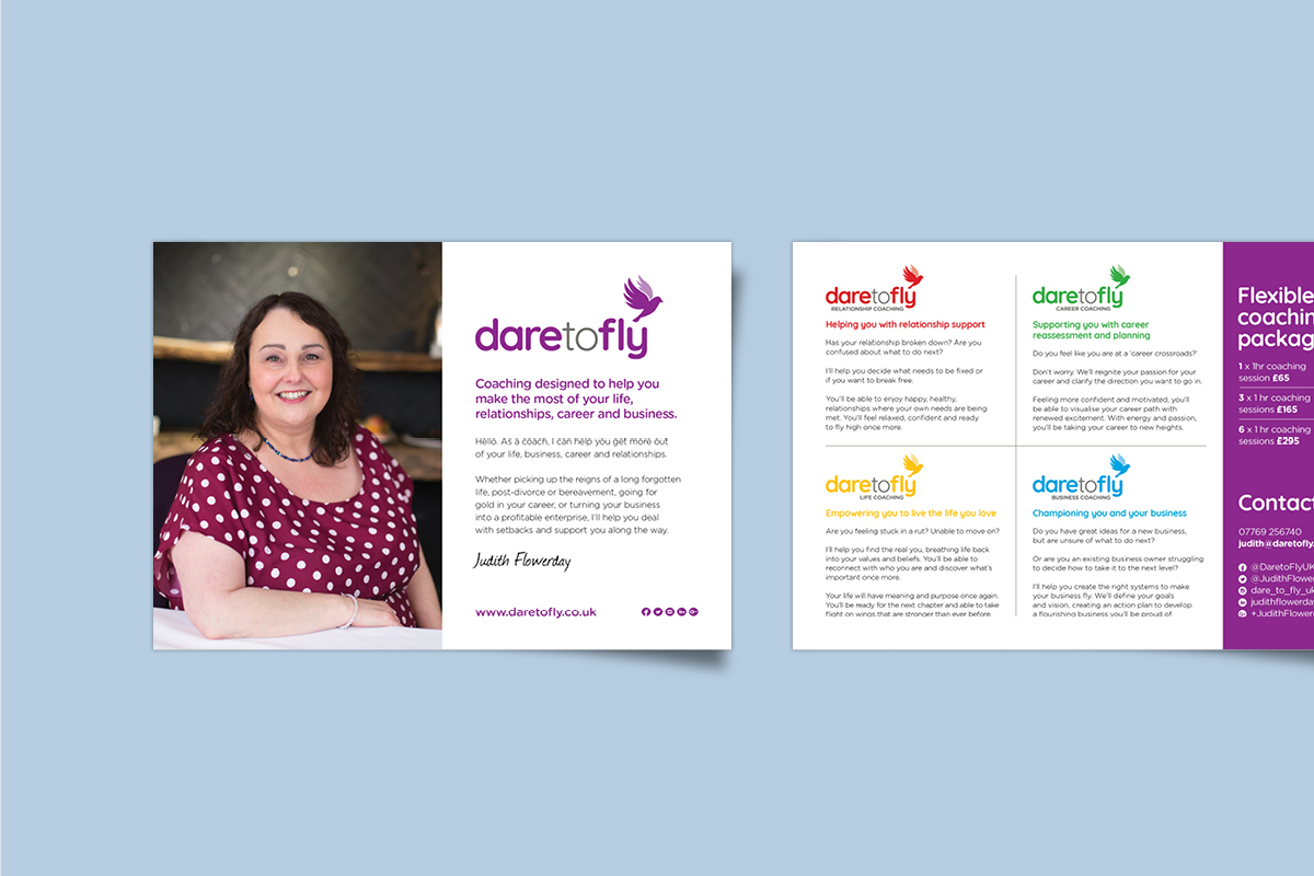
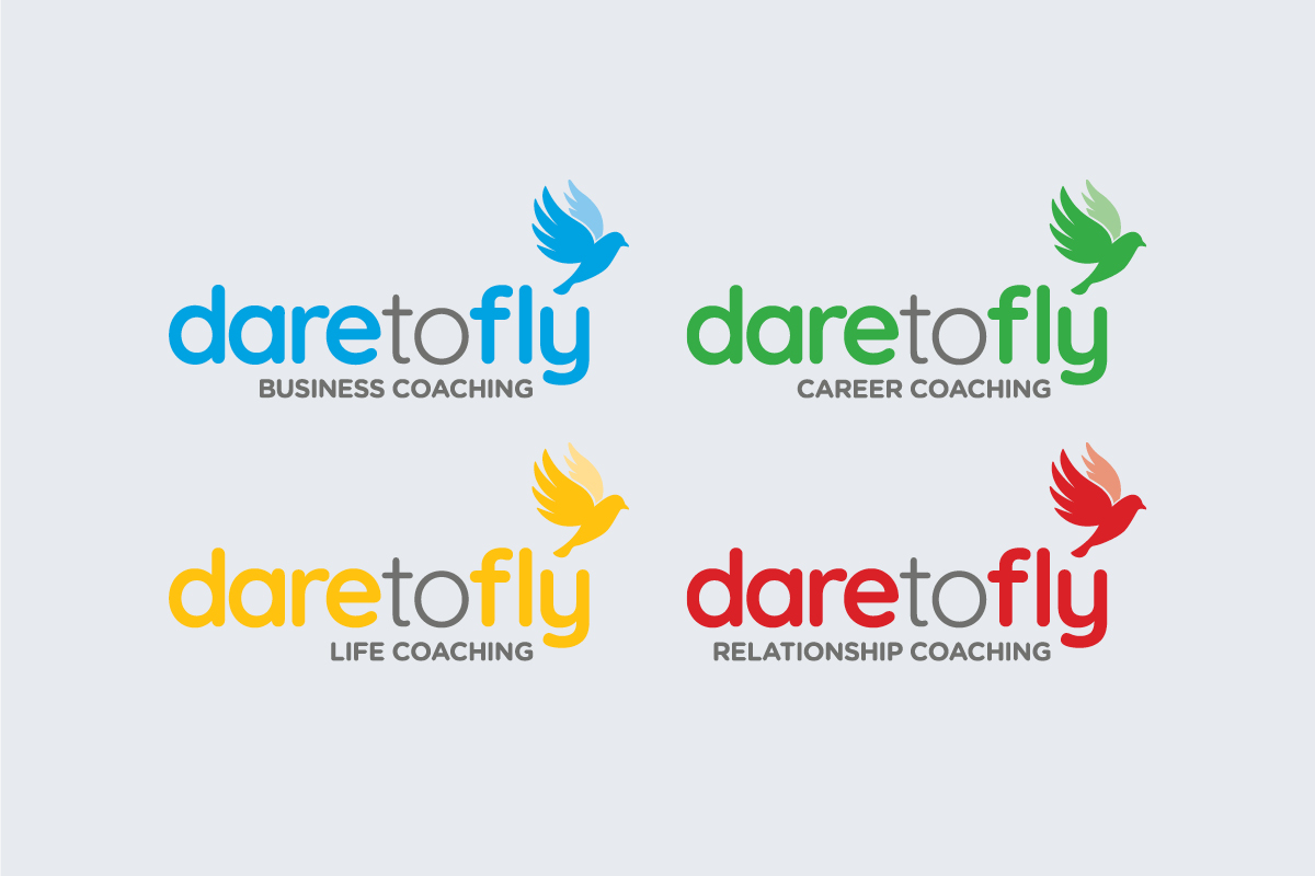
Dare to Fly is a Norfolk-based coaching business, owned by experienced coach Judith Flowerday. Judith has four main areas she helps clients with: careers, business, lifestyle and relationships. Dare to Fly needed an updated brand that could appropriately represent this broad range of categories.
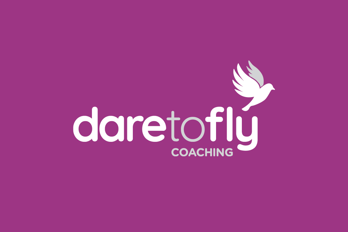
The biggest challenge was finding a visual tone that would create the right image for both business and lifestyle clients. It needed to be able to reflect a professional service, capable of helping clients with serious business advice. At the same time, lifestyle clients will likely be sharing sensitive personal information, so the brand couldn’t come across as too corporate or stark. The final design could be described as ‘soft-corporate’. It features a clean, simple icon with an equally open and clear font. This is softened with use of bright, bold colours as well as a rounded font.
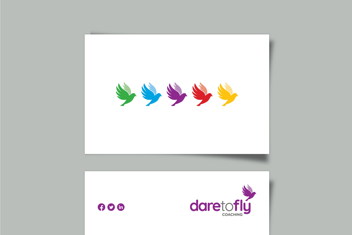
The choice of a bird for the supporting symbol relates not only to the ‘fly’ in Dare to Fly, but to the brand as a whole. The core value of Dare to Fly is helping their clients achieve freedom, whether in their personal or work life. What better image to communicate freedom than a flying bird? The colours for each individual category have been chosen to reflect the right emotions, while keeping consistent with each-other.
The final result is a bright and clear brand identity that feels accessible to everyone, while being taken seriously by business clients.